Responsive Web Design That Adapts, Engages, and Converts
At Vinxor, we do not just create attractive looks, we deliver responsive web designs functioning perfectly well with any device; be it a desktop computer or a mobile smartphone. As the leading responsive web design agency in the UK, we focus on delivering you a website that is fully compatible with all desktops, tablets, and mobile screens for an intuitive experience every single time.


Designed for All Screens, Built for Every Goal
Whether you’re a startup looking to establish an online presence or an enterprise boosting your tech setup and digital infrastructure , Vinxor’s flexible web design services help scale with your vision. We collaborate with you to learn about your users,industry, and goals—then design a responsive site.
Be it a new beginning or remodeling an outdated site, our responsive web design services ensure that your brand speaks well and acts accordingly in today’s mobile-first digital landscape.
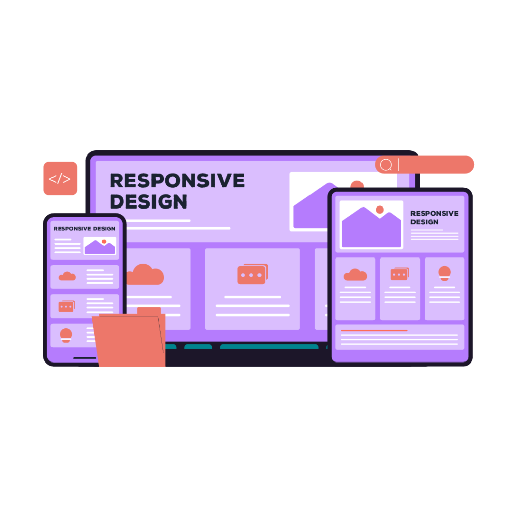
Why Responsive Design Matters
Over 60% of web traffic comes from mobile devices. So, having a responsive website isn’t optional- it’s essential. A responsive site improves user engagement, reduces bounce rates, increases conversions offering the same experience across all screen sizes.
And let’s not forget Google. Mobile-first indexing denotes that your site’s performance on smaller screens directly impacts your search rankings. Our team comes up with layouts that are visually engaging and responsive as well as SEO-optimised for maximum visibility.
What We Deliver as a Responsive Web Design Agency
A strategic mix of creativity, usability, and performance is what you get when you work with Vinxor, a leading responsive web design company. Here’s what you can look forward to:
Mobile-First Design
Mobile-first design ensures seamless site performance across every screen.
Cross-Browser Compatibility
Your website will Look perfect and Work flawlessly on Chrome, Safari, Firefox, Edge and so on.
Speed & Performance Optimisation
A slow site does not provide conversions. We fully optimise load speed and responsiveness.
SEO-Friendly Code
Our clean and semantic HTML/CSS structure lets search engines crawl and Index better.
Custom-Tailored User Experience
No templates, no shortcuts. Everything is designed for your people and your goals.